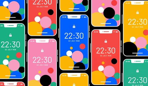
In the intricate world of design systems, color contrast is not merely an aesthetic consideration but a fundamental requirement for usability, readability, and, crucially, accessibility. Ensuring that text is easily distinguishable from its background and that interactive elements have sufficient contrast is essential for users with visual impairments and contributes to a better experience for everyone. However, achieving consistently perceivable color relationships across a complex design system with numerous color variations and UI components can be a significant challenge with traditional color models. Harmony emerges as a color palette specifically designed to elevate control over color contrast in design systems, built on a foundation of modern color science and accessibility standards to deliver highly consistent color shades and maintain precise control over text and UI element contrast, enhancing accessibility in design.
The importance of sufficient color contrast is underscored by accessibility guidelines such as the Web Content Accessibility Guidelines (WCAG), which provide standards for minimum contrast ratios to ensure content is perceivable by individuals with various visual abilities. Designers working within design systems face the complex task of defining a color palette that not only meets aesthetic requirements but also provides a comprehensive range of color combinations that satisfy these accessibility standards across all components and use cases. Traditional color spaces like HSL and RGB can be perceptually uneven, making it difficult to predict how colors will appear in combination and leading to inconsistencies in perceived contrast.
Harmony tackles this challenge by directly addressing the need for enhanced control over color contrast. It is a color palette purposefully constructed for use within design systems, where consistency and predictability are paramount. The palette's design prioritizes the ability for designers to confidently select color combinations knowing they will meet specific contrast requirements for both textual content and interactive UI elements.
A key technical underpinning of Harmony is its utilizing OKLCH and APCA for highly consistent color shades. OKLCH is a perceptual color space designed to be more perceptually uniform than traditional models, meaning that changes in numerical values within the OKLCH space correspond more closely to how humans perceive changes in color. This results in highly consistent color shades within the Harmony palette, where variations in lightness and chroma are perceived more evenly, leading to more predictable color relationships and, consequently, more reliable contrast. APCA (Accessible Perceptual Contrast Algorithm) is a newer method for calculating contrast that is gaining traction as a more accurate measure of perceived contrast, particularly for text. By leveraging APCA, Harmony allows designers to work with a contrast metric that is more aligned with actual human vision, enabling them to achieve more precise and reliable contrast control than with older algorithms.
Harmony also embraces modern display capabilities by offering P3 options for modern screens. The P3 color space supports a wider gamut of colors than the standard sRGB space, allowing for more vibrant and saturated hues. By providing options within the P3 gamut, Harmony enables designers to create visually richer and more impactful designs while still maintaining the precise control over contrast facilitated by OKLCH and APCA. This means designers do not have to sacrifice vibrancy for accessibility but can leverage the capabilities of modern displays to create inclusive and visually stunning experiences.
The practical application of Harmony within a design system is evident in its ability to maintain precise control over text and UI element contrast, enhancing accessibility in design. By using Harmony, designers can define color roles and combinations within their system with confidence, knowing that the underlying structure of the palette, informed by OKLCH and APCA, supports consistent and predictable contrast. This streamlines the process of ensuring accessibility compliance for color, reducing the need for extensive manual testing and adjustments across numerous components. The result is a design system that is inherently more accessible, providing a better experience for all users, including those with low vision or other visual impairments.
The target audience for Harmony includes UI/UX designers responsible for creating user interfaces, design system creators building scalable visual languages, accessibility specialists ensuring digital products meet compliance standards, and web developers implementing designs with a focus on inclusivity. For these professionals, Harmony offers a sophisticated and perception-aware color foundation that simplifies the process of creating accessible designs from the ground up, providing confidence in achieving consistent contrast across all elements and leveraging modern color capabilities without compromising on accessibility.
In conclusion, Harmony stands as a meticulously engineered color palette that fundamentally rethinks color for design systems with a strong emphasis on contrast control and accessibility. By utilizing advanced color models and standards like OKLCH and APCA for highly consistent shades, offering P3 options for modern screens, and focusing on maintaining precise control over text and UI element contrast, Harmony effectively elevates accessibility in design. It provides designers with a technically advanced and perception-aware color foundation, empowering them to build inclusive, visually appealing, and highly usable digital experiences that cater to a broad range of users with confidence and precision.

